In this article we’re going to be talking about k-means clustering, we’re gonna learn how to cluster samples that can be put on a line, on an XY graph, and even on a heat map and lastly, we’ll also talk about how to pick the best value for K.
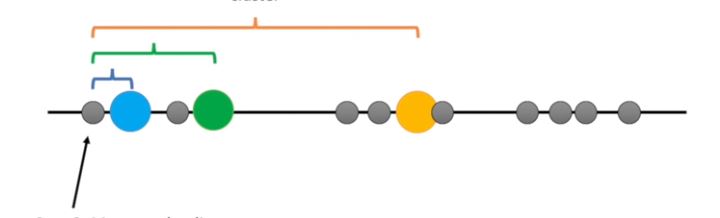
Imagine you had some data that you could plot on a line, and you knew you needed to put it into three clusters maybe they are measurements from three different types of tumors or other cell types.
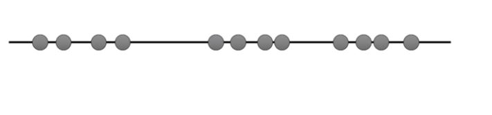
Imagine you had some data that you could plot on a line, and you knew you needed to put it into three clusters maybe they are measurements from three different types of tumors or other cell types.
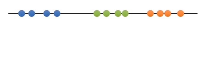
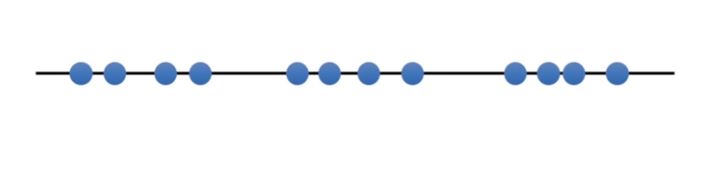
In this case the data make three relatively obvious clusters but rather than rely on our eye let’s see if we can get a computer to identify the same three clusters. To do this we’ll use k-means clustering. We’ll start with raw data that we haven’t yet clustered.
- Step one select the number of clusters you want to identify in your data. This is the K in k-means clustering, in this case, we’ll select K equals three that is to say: we want to identify three clusters. There is a fancier way to select a value for K but we’ll talk about that later.
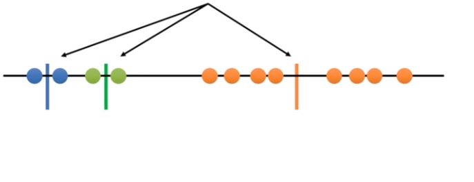
- Step two randomly select three distinct data points these are the initial clusters.
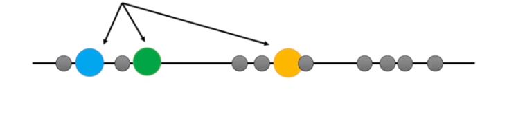
step 3 measure the distance between the first point and the three initial clusters.
This is the distance from the first point to the blue cluster, this is the distance from the first point to the green cluster, and this is the distance from the first point to the orange cluster.
Well it’s kind of yellow but we’ll just call it orange for now.
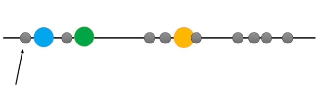
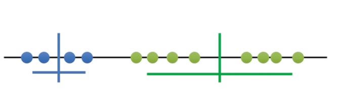
- step 4 assign the first point to the nearest cluster. In this case the nearest cluster is the blue cluster.
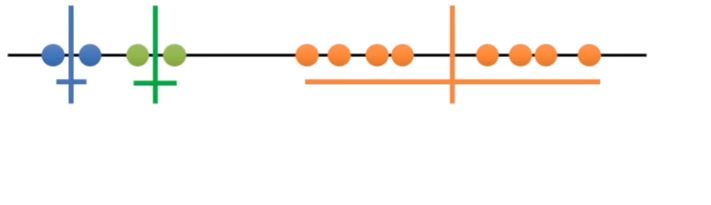
Now we do the same thing for the next point, we measure the distances and then assign the point to the nearest cluster.
Now we figure out which cluster the third point belongs to we measure the distances and then assign the point to the nearest cluster. The rest of these points are closest to the orange cluster so they’ll go in that one too.
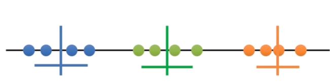
- Step 5 calculate the mean of each cluster then we repeat what we just did measure and cluster using the mean values.
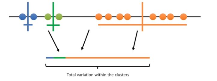
Since the clustering did not change at all during the last iteration, we’re done.
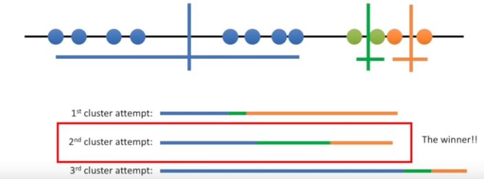
The k-means clustering is pretty terrible compared to what we did by eye. We can assess the quality of the clustering by adding up the variation within each cluster. Here’s the total variation within the clusters.
Since k-means clustering can’t see the best clustering it’s only option is to keep track of these clusters and their total variance and do the whole thing over again with different starting points.
So here we are again back at the beginning k-means clustering picks three initial clusters and then clusters all the remaining points calculates the mean of each cluster and then re clusters based on the new means it repeats until the cluster is no longer change.
K-means Clustering: how to pick the winner cluster
Now that the data are clustered we sum the variation within each cluster and then we do it all again at this point k-means clustering knows that the second clustering is the best clustering so far; but it doesn’t know if it’s the best overall so it will do a few more clusters it does as many as you tell it to do and then come back and return that one if it is still the best.
Question how do you figure out what value to use for K? With this data it’s obvious that we should set K to three, but other times it is not so clear. One way to decide is to just try different values for K.
We’ll start with k equals 1. K equals 1 is the worst-case scenario.
We can quantify its badness with the total variation.
Now try K equals 2. K equals 2 is better and we can quantify how much better by comparing the total variation within the two clusters to K equals 1.
Now try K equals 3. K equals 3 is even better, we can quantify how much better by comparing the total variation within the three clusters to k equals 2
Now try k equals 4 the total variation within each cluster is less than when K equals 3
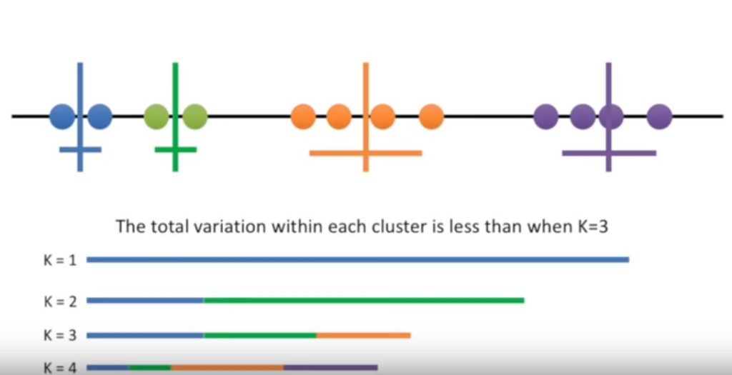
Each time we add a new cluster the total variation within each cluster is smaller than before and when there is only one point per cluster the variation equals 0. However, if we plot the reduction in variance per value for K there is a huge reduction in variation with K equals three but after that, the variation doesn’t go down as quickly.
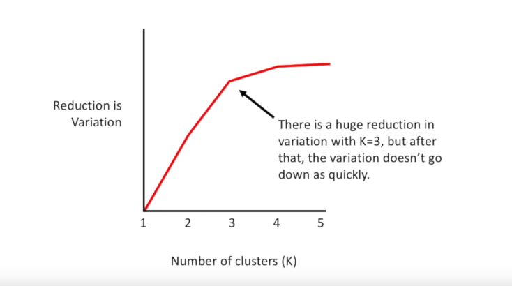
This is called an elbow plot and you can pick K by finding the elbow in the plot.
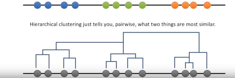
Question how is k-means clustering different from hierarchical clustering?
k-means clustering specifically tries to put the data into the number of clusters you tell it to. Hierarchical clustering just tells you pairwise what two things are most similar.
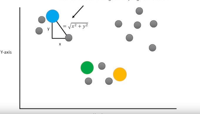
Question what if our data isn’t plotted on a number line? just like before you pick three random points and we use the Euclidean distance in two dimensions the Euclidean distance is the same thing as the Pythagorean theorem then just like before we assign the point to the nearest cluster and just like before we then calculate the center of each cluster and re cluster.
Reader’s top pick: Python Projects For Beginners – Learn with 10 Examples
Although this looks good the computer doesn’t know that until it does the clustering a few more times.
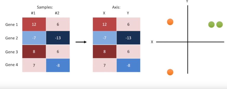
Question what if my data is a heatmap? well if we just have two samples we can rename them x and y and we can then plot the data in an XY graph then we can cluster just like before.
Note: we don’t actually need to plot the data in order to cluster it we just need to calculate the distances between things. When we have two samples or two axes the Euclidean distance is the square root of x squared plus y squared. When we have three samples or three axes the Euclidean distance is the square root of x squared plus y squared plus Z squared, and when we have four samples or four axes the Euclidean distance is the square root of x squared plus y squared plus Z squared plus a squared
Here are a few notes on using the k-means function in R
- First it adds weights to each distance giving ever so slightly more weight to large clusters than to small clusters
- Second by default it only tries one set of initial clusters you have to set inclust to 25 or so in order to try a bunch of different starting points
We’ve made it to the end of another exciting tutorial. If you like this article and want to see more please share it with your friends, and if you want to support astateofdata.com consider buying one or two of my courses.